Visualization link: https://ourworldindata.org/covid-mobility-trends
What is its purpose?
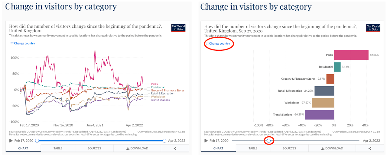
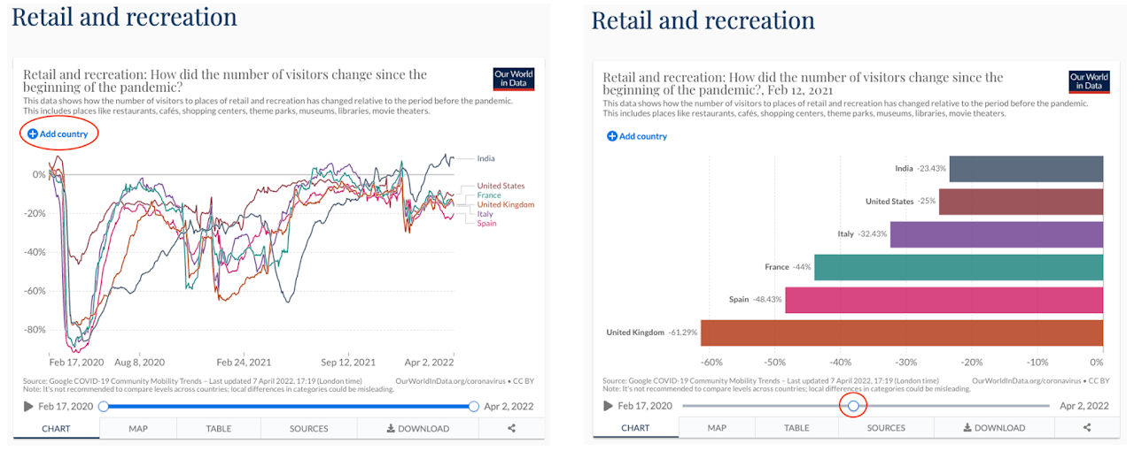
The visualizations here give insights into how effective Covid lockdown restrictions and other policies were in terms of reducing human movement. It also gives an idea about how people across the world work; live; and where they visit. The line chart shows the change in visitor numbers to specific categories of location (e.g. grocery stores; parks; train stations). The change is relative to baseline days before the pandemic outbreak. Instead of time range, if users choose a specific date, they will be able to see the percentage of visitor change for that specific date since the pandemic. Users can also choose a country using the input option from the top left.
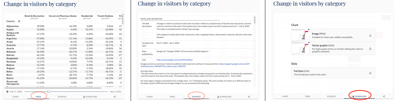
Users can also see the data as a table that was used to generate the chart, see the sources of the data and also download the data.
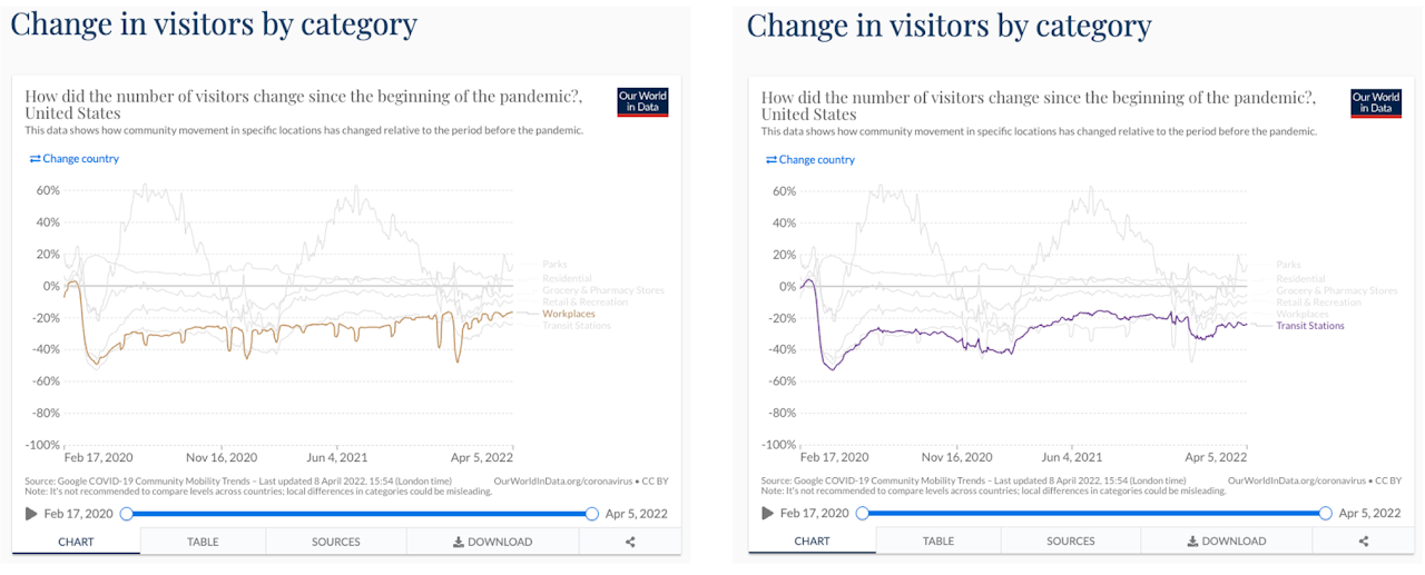
There are separate interactive charts for each specific category of location (e.g. grocery stores, parks, or train stations). Initially, these visualizations show the percentage of visitor change in the countries around the world as a choropleth map (Note: data for some of the countries is missing). Users can filter the map by choosing a specific continent.
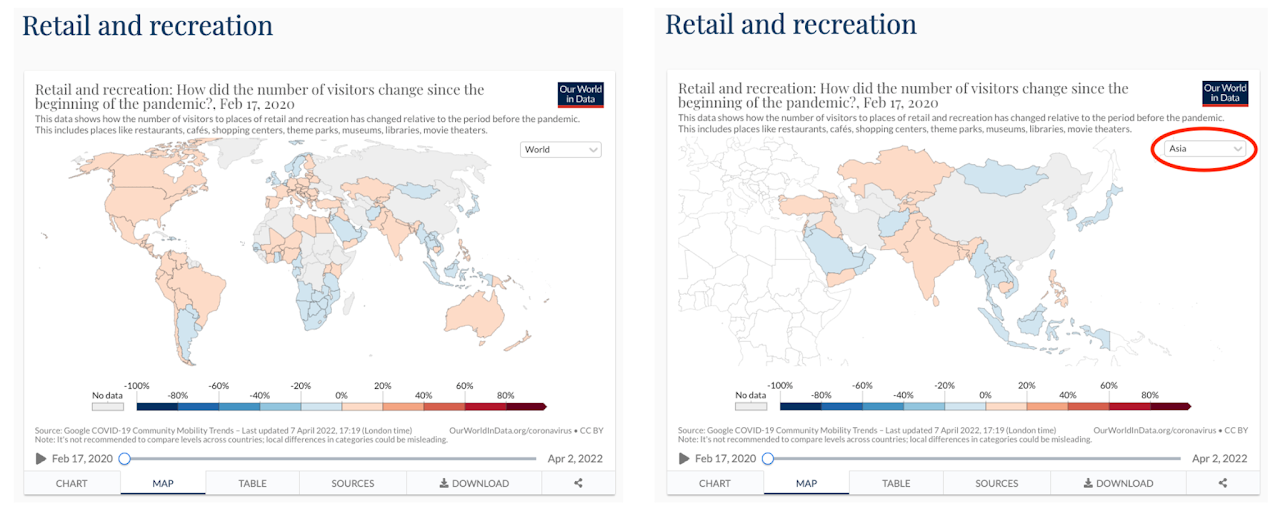
Users can also hover over any country on the map to get some insights and by clicking on a country, the visualization makes a smooth transition to the line chart for that chosen country.
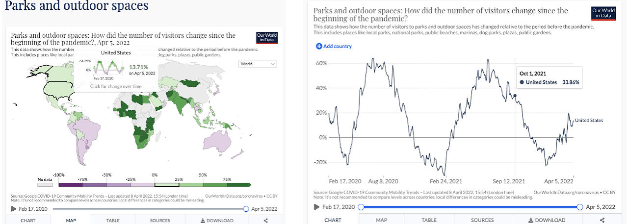
Users can also choose to visualize the data with a line chart for a specific set of countries. They can add more countries to the chart using the option from the top left. Instead of time range, if users choose a specific date, they will be able to see the percentage of visitor change for that specific date for the chosen countries.
What is the data?
The data used here is provided by Google's "COVID-19 Community Mobility Reports". This dataset from Google measures visitor numbers to specific categories of location (e.g. grocery stores; parks; train stations) every day and compares this change relative to baseline days before the pandemic outbreak. Baseline days represent a normal value for that day of the week and are given as the median value over the five‑week period from January 3rd to February 6th 2020. Measuring it relative to a normal value for that day of the week is helpful because people obviously often have different routines on weekends versus weekdays. The aim of publishing this data was to provide insights into what has changed in response to policies aimed at combating COVID-19. The dataset contains movement trends over time by geography, across different categories of places such as retail and recreation, groceries and pharmacies, parks, transit stations, workplaces, and residential. These datasets will be available for a limited time, so long as public health officials find them useful in their work to stop the spread of COVID-19.
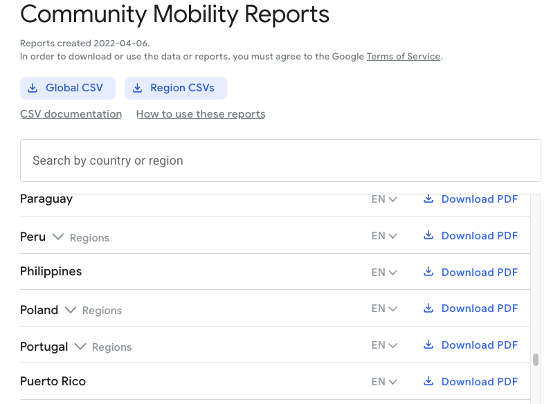
Link to original data: https://www.google.com/covid19/mobility
The data is available in global and regional CSV files.
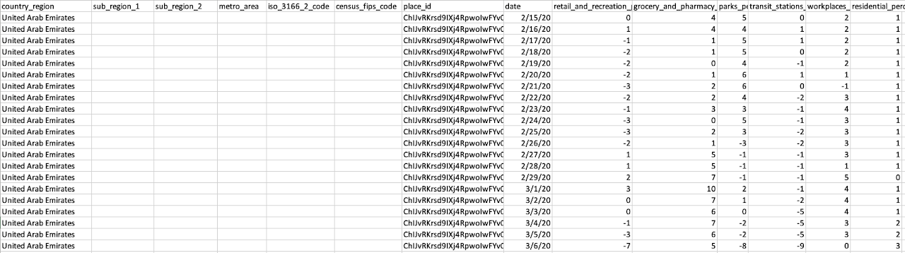
Snapshot of the data looks like below.
Additionally, Google provided some important gotchas for using the data. Those are listed below:
- One should avoid comparing across regions or countries; this is because there may be local differences in categories which could be misleading.
- We should also emphasize that change in visitors is measured relative to the baseline period between January and February 2020. This means changes in movement do not take account of seasonal variation – for example, we might expect visitors to parks or outdoor spaces to be higher during the summer. The data may therefore reflect some changes in seasonal movements, rather than being fully explained by changes due to the pandemic.
- The amount of day-to-day variability in the raw data can make it difficult to understand how overall movements are changing over time. To make this easier to understand, we have converted the raw data into the seven-day rolling average. This is what is shown in the data in the following charts.
How was the data collected?
Using anonymized data provided by apps such as Google Maps, Google has produced a regularly updated this dataset that shows how peoples’ movements have changed throughout the pandemic. They mentioned that the data was generated adhering to stringent privacy protocols and protecting people’s privacy and no personally identifiable information, such as an individual’s location, contacts or movement, will be made available at any point.
Who are the users that this visualization was made for?
The main target audience for these visualizations are the public health officials across the world who can get insights into the changes in response to policies aimed at combating COVID-19. However, the visualizations are available to everyone who wants to view them online on the website ourworldindata.org. As it is available online, it allows for a lot more users to view and make use of the visualization for private studies or research purposes.
What questions do people want to ask?
Some of the basic questions that come to mind when looking at the visualizations are:
- Which category of location was most impacted (ie: parks, residential, grocery, etc.) for a particular country?
- What was the time people started to go back to their workplaces?
- During the start of the pandemic, people rushed to get groceries. When did it start to normalize?
- How is the public transport sector impacted due to COVID?
Answering questions with the visualization
The visualizations have many small details that provide a lot of information that can be used to answer questions about human mobility during the pandemic. Let's answer the questions mentioned above.
Which category of locations were most impacted (ie: parks, residential, grocery, etc.) for a particular country?
To answer this question we need to use the visualization that shows changes in visitors by category. Upon choosing the USA, we can clearly see that movement to transit stations and workplaces was most impacted due to COVID restrictions.
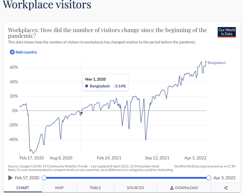
What was the time people started to go back to their workplaces?
To answer this question we need to use the visualization that shows changes in visitors for workplace visitors. Upon choosing the country Bangladesh, we can see that starting November 2020 people started to go back to their workplaces.
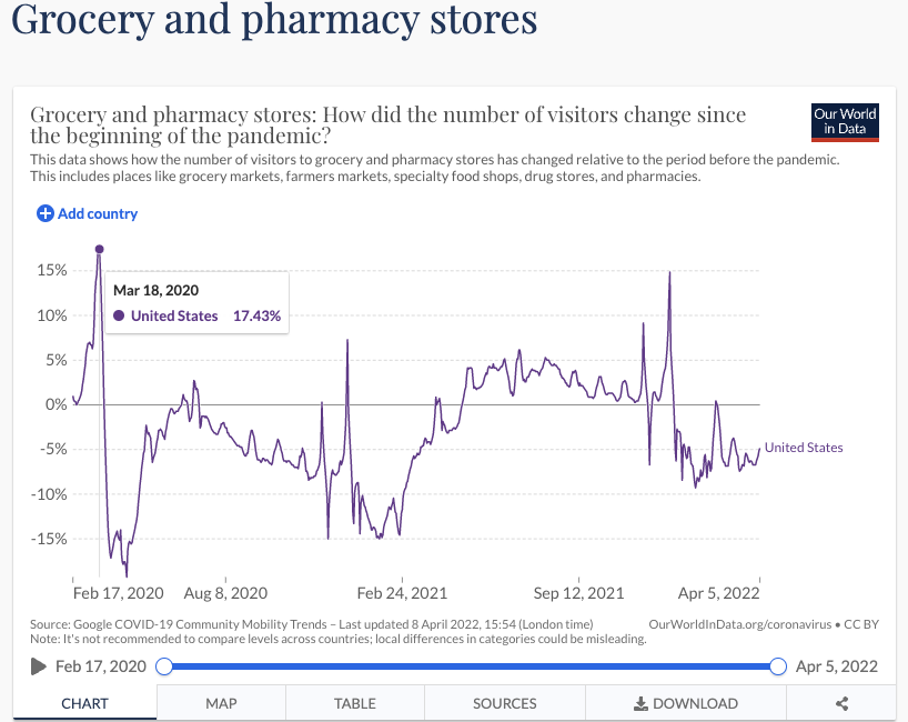
During the start of the pandemic, people rushed to get groceries. When did it start to normalize?
To answer this question we need to use the visualization that shows changes in visitors to grocery and pharmacy stores. Upon choosing country the USA, we can see that in mid-March 2020 (when COVID hit the USA) people rushed to the grocery stores, and at the end of March the madness stopped.
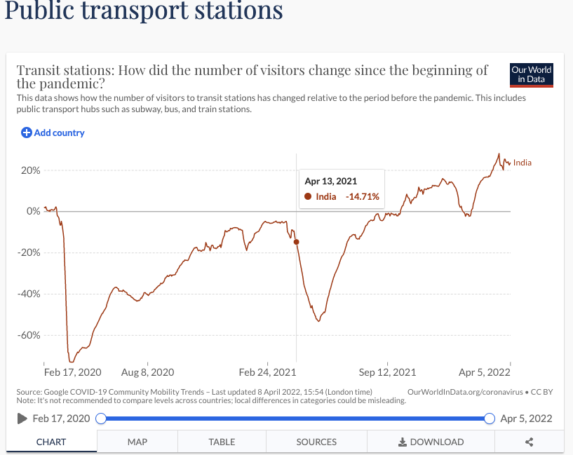
How was the public transport sector in India impacted due to COVID?
To answer this question we need to use the visualization that shows changes in visitors to public transport sections. Upon choosing the country India, we can see that at the beginning of the pandemic public transport mobility stooped very low, but then it started to normalize. However, starting April 2021 the B.1.617 Delta variant hit India in a serious manner and there was a surge in COVID cases and deaths which explains the second dip in public transport mobility.
What works in the visualizations?
The visualizations are very successful in displaying information and conveying it in an easy manner to the viewer. The information is displayed very easily and the incorporation of colors makes it easy to understand and comprehend. The color choice is also good because it is easy on the eyes and isn't too bright so that it stands out.
In line charts, if the user hovers over a line, the line gets highlighted which is a very nice touch. Users can access data tables that were used for each of the visualizations and also download the data to reproduce the visualizations. The feature to add or remove countries in a line chart is also nice because it gives insights into the difference in impacts of COVID 19 in different countries. The hover feature over the elements in all the visualization is a key factor for convenience and understanding.
Letting the user choose a specific date (instead of a time range) is also a very nice feature as it allows for the user to quickly grasp the change in mobility for individual dates. The filter system based on an entry from the map is nice as it allows the user to select a particular state or crash to focus on and get more information. The option to see the change in mobility across the world as a timelapse seemed brilliant to me.
What neds improvement?
The visualizations have one very minor and nitpicky issue. The issue I found was that we cannot highlight a particular country's line in the line charts. It could have been a nice option to choose a country's line and hover over its values. Also, I would have kept the colors consistent for all the choropleth maps. In "Public Transport Station" chart, red color represents increase in mobility with respect to pre-covid times, whereas in "Worplace Visitors" chart red color represents decrease in mobility with respect to pre-covid times.