Access this project
Demo URL: http://shiny.evl.uic.edu:3838/g5/CS-424-Project-3-kzo/
Introduction video: https://www.youtube.com/watch?v=hREgA79KWEo
GitHub repo: https://github.com/komar41/Big-Yellow-Taxi
Tools used: Python, Pandas, Numpy, R, and Shiny.
The visulization was created for a screen with resolution of 5760x1620 (Sage screen of EVL UIC Lab). [For reference see picture below]
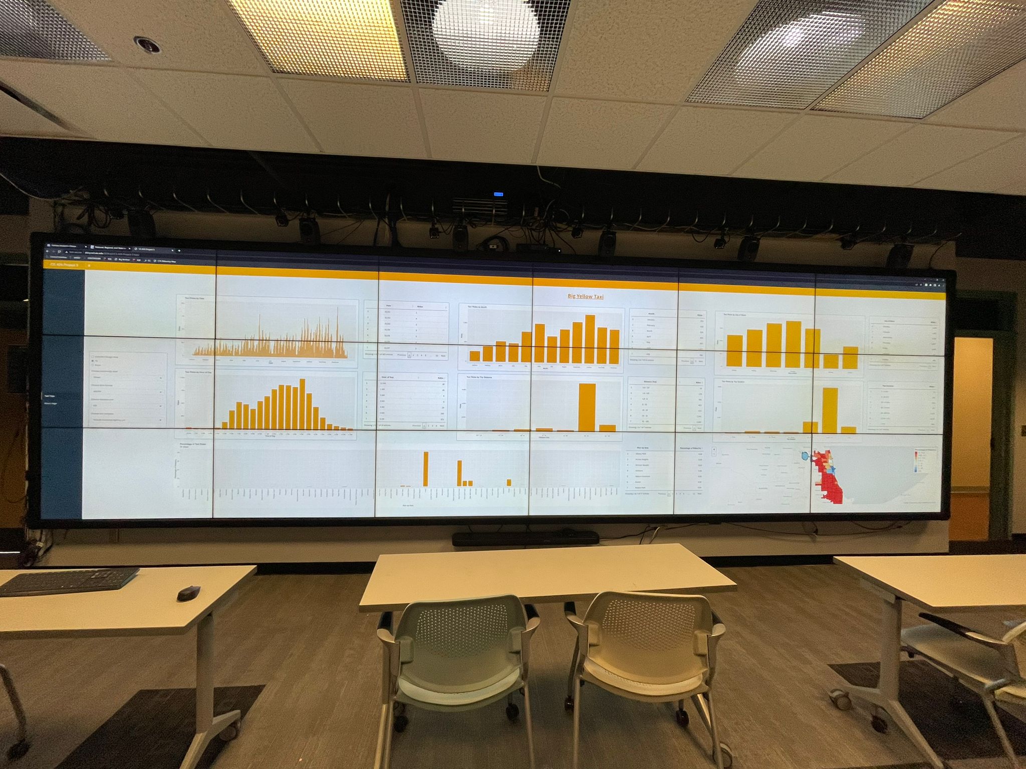
This project is intended for visualizing the trends and interesting patterns in Taxi ridership data (2019) in Chicago. We are choosing to look at data from 2019 data is because it is pre-COVID data and more representative of a 'typical' year.
User Interface
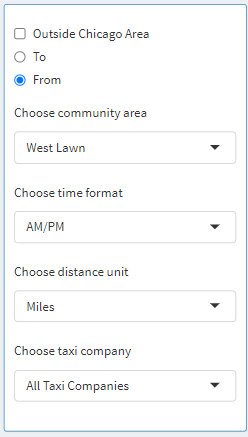
Let us focus our attention on the control panel. The visualization starts with Chicago as a chosen community area, which means data from every community in Chicago is aggregated. Furthermore, the user can select the Outside Chicago Area checkbox to also include the data for when the taxi ride started or ended in Chicago. Next, the user can go ahead by selecting West Lawn as the community area, after which From and To radio buttons come to life as they are enabled. Here we can specify and aggregate data for only when the trip started from West Lawn and ended somewhere in Chicago, or when the trip started somewhere in Chicago and ended in West Lawn. This is assuming the fact that the Outside Chicago Area is deselected. If the Outside Chicago Area is selected when West Lawn is chosen as the community area then the following is how the data would be aggregated: Trip started from or ended in West Lawn regardless of destination or starting point, respectively. Next, the user can select between the time formats: 12-hour or 24-hour. These changes are reflected in the bar graph and the table where time is displayed. Next, the user can select a distance unit between either Miles or Kilometers. These changes are reflected in the bar graph and the table where time is displayed. Next, the user can select whether they want to look at data from a specific taxi company or display data from all the companies. This helps the user investigate specific statistics about an individual taxi company.
On the "About" page, some details are listed such as creators of the application, date published, data sources, data owner, etc.

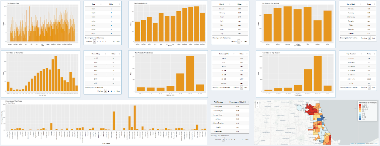
Next, we will look at graphs and tables associated with the graphs. Then at the end, we will look at a map that displays ridership data per community. The data displayed in the graph adapts based on the controls we explored above.
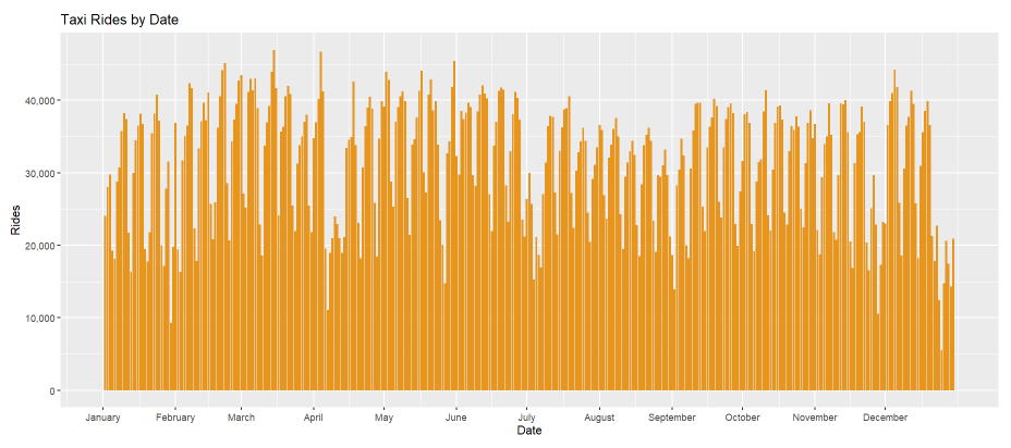
On the left-hand side, the graph displays one bar for each day of 2019 and each bar represents rides for that day. On the right-hand side, the same data can be explored in a tabular format, where users can look at individual data points. The table can be sorted in an ascending or descending order for each column.

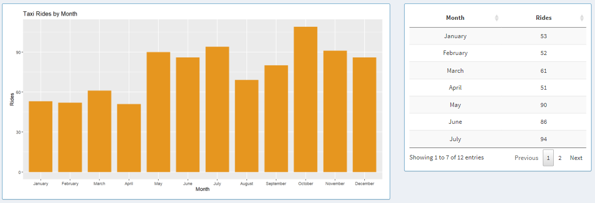
On the left-hand side, the graph displays one bar for each month of 2019 and each bar represents rides for that month. On the right-hand side, the same data can be explored in a tabular format, where users can look at data aggregated for each month.

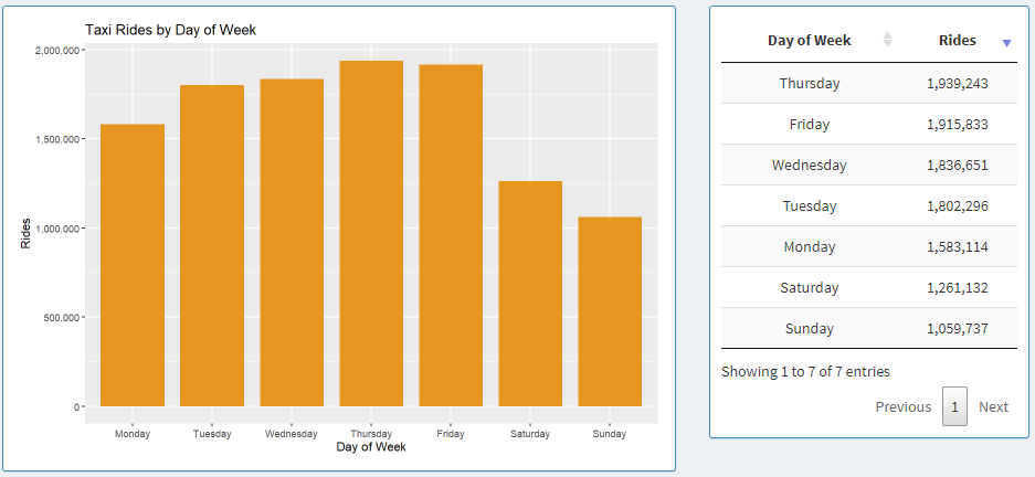
Here, the graph displays aggregated data for each day of the week in 2019 starting from Monday to Sunday. Next to the graph, we can see the data shown in a table, where each column can be sorted in ascending or descending order by clicking on the column names.
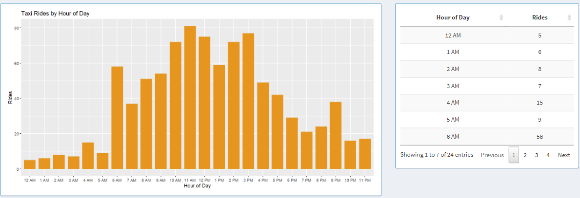
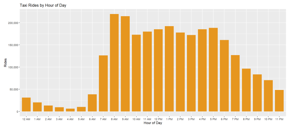
Next, we have taxi rides by the hour of the day. Here, the graph shows aggregated data about each day in 2019. The x-axis adapts to a 12-hour or 24-hour format based on the controls that we explored in the earlier section. Next to the graph, we can see the data from the graph shown in a table, where the data can be sorted in ascending or descending order by clicking on the column names in the table.
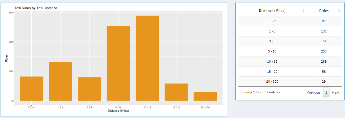
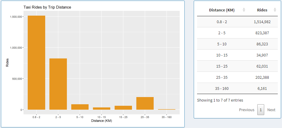
Here we have a graph that shows data based on trip range. The trip distance can be adapted to two distance formats based on the controls on the left side: Miles and Kilometers. When Kilometers is selected, ranges are broken down based on the following bins: 0.8 - 2, 2 - 5, 5 - 10, 10 - 15, 15 - 25, 25 - 35, 35 - 160. When Miles is selected, ranges are broken down based on the following bins: 0.5 - 1, 1 - 3, 3 - 5, 5 - 10, 10 - 15, 15 - 20, 20 - 100. Next to the graph, we can see the data from the graph shown in a table, where the data can be sorted by trip range or rides count for each bin in ascending or descending order by clicking on the column names in the table.
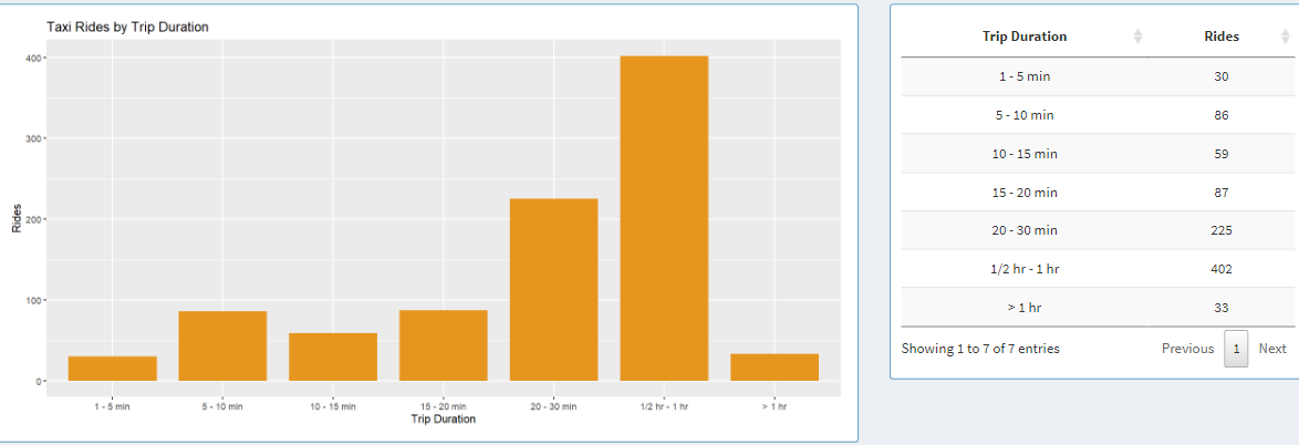
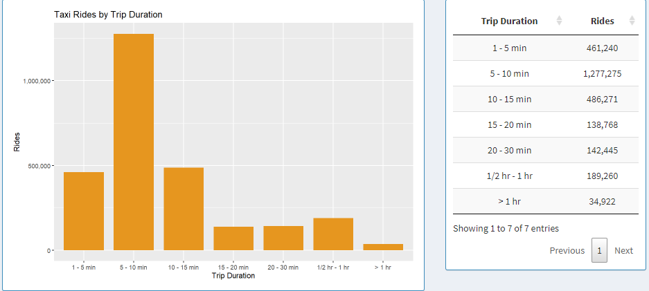
Here we have a graph that shows data based on trip duration. The time duration is broken down into 7 subset: 1 - 5 min, 5 - 10 min, 10 - 15 min, 15 - 20 min, 15 - 20, 20 - 30 min, 1/2 hr - 1 hr, > 1 hr. Each bar in the graph and each table entry in the table represents each one of those bins.
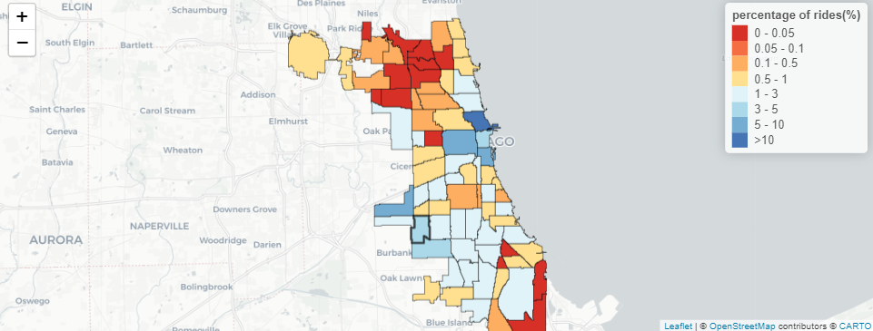
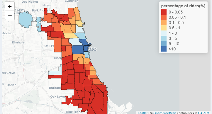
Here, the x-axis represents either the destination or the starting point based on whether the user clicks the radio button To or From. The y-axis represents the percentage of riders traveling from one point to another. It makes more sense when we look at the title. Let us select West Lawn as the community area and click on the To radio button. The graph shows the percentage of riders traveling from the community area on the graph to West Lawn. On the right-hand side, we have a table that displays the same data but in a tabular format. The percentage can be sorted from low to high or vice-versa. The name can also be sorted by the pick-up area or drop-off area depending on where you chose To or From on the radio button, respectively.

Furthermore, the data we looked at in the graph is also represented on the map with a heat map. On the upper right of the map, we have legends that go from Red color to Blue color hue representing low to high percentages of riders. Additionally, the community area can be selected by clicking on the community area on the map. When you hover over the community area on the map, you can also see the name and percentage of riders traveling from or to that community area.
About the Data
Data source: Two datasets were used to build the application. Both datasets were collected from Chicago Data Portal.
-
The dataset that contains information about Taxi rides in Chicago for 2019 can be found here. The file size is 7GB.
-
The dataset that contains information regarding boundaries for each community area in Chicago can be found here. The file size is 2MB.
Data usage: The taxi trips from the 2019 dataset contain 23 columns of which we are only concerned with looking at 6 of them for this visualization. Trip Start Timestamp is a string that describes when the trip started, rounded to the nearest 15 minutes. Trip Seconds is an integer that describes the time of the trip in seconds. Trip Miles is a float that describes the distance of the trip in miles. Pickup Community Area is an integer that describes the Community Area where the trip began and this column would be blank for locations outside Chicago. Dropoff Community Area is an integer that describes the Community Area where the trip ended and this column would be blank for locations outside Chicago. Company is a string that describes the taxi company that ran that specific taxi service for the trip.
The Boundaries - Community Areas dataset contains information about the boundaries of each community area in Chicago. This data is downloadable in GEOJSON format, which can be further used to describe each community with a color on a map in RStudio.
The EVL shiny-server at UIC was used to publish this project. To make the project responsive and create the start-up time as quickly as possible, we split up the data into various subfolders with their CSV files. Two datasets need to be downloaded, both of which are provided at the bottom of the page. Python script used for splitting the ridership data is provided below:
import os
import numpy as np
import pandas as pd
import csv
from datetime import datetime
import warnings
warnings.filterwarnings("ignore")

def mkdir(dir):
    if not os.path.exists(dir):
        os.mkdir(dir)

def preprocess(df, dictCompany):
    df = df[['Trip Seconds', 'Trip Miles', 'Pickup Community Area', 'Dropoff Community Area', 'Company', 'Trip Start Timestamp']]
    df = df[(df['Trip Miles']>=0.5) & (df['Trip Miles']<=100)]
    df['tripKM'] = df['Trip Miles'].apply(lambda x: round(x*1.609,2))
    df = df[(df['Trip Seconds']>=60) & (df['Trip Seconds']<=18000)]
    df['Pickup Community Area'] = df['Pickup Community Area'].mask( ~((df['Pickup Community Area']>=1) & (df['Pickup Community Area']<=77)), 78)
    df['Dropoff Community Area'] = df['Dropoff Community Area'].mask( ~((df['Dropoff Community Area']>=1) & (df['Dropoff Community Area']<=77)), 78)
    df = df[~((df['Pickup Community Area']==78) & (df['Dropoff Community Area']==78))]
    df = df.replace({"Company": dictCompany})
    df = df.dropna()
    df['Trip Start Timestamp'] = pd.to_datetime(df['Trip Start Timestamp'])
    df['Trip Start Timestamp'] = df['Trip Start Timestamp'].apply(lambda x: pd.datetime(x.year, x.month, x.day, x.hour, 0, 0))
    df['Pickup Community Area'] = df['Pickup Community Area'].astype(int)
    df['Dropoff Community Area'] = df['Dropoff Community Area'].astype(int)
    df['Trip Seconds'] = df['Trip Seconds'].astype(int)
    df = df.rename(columns={'Trip Seconds': 'tripSeconds', 'Trip Miles': 'tripMiles', 'Pickup Community Area': 'pickupArea', 'Dropoff Community Area': 'dropArea', 'Company': 'company', 'Trip Start Timestamp': 'tripStartTime'})

    return df

def preCalc(df, str, drop=False, pick=False, outChicago=False):
    df_date = df.groupby([df['tripStartTime'].dt.date]).size().to_frame().reset_index().rename(columns={'tripStartTime': 'Date',0: 'Count'})
    df_hour = df.groupby([df['tripStartTime'].dt.hour]).size().to_frame().reset_index().rename(columns={'tripStartTime': 'Hour', 0: 'Count'})
    df_day = df.groupby([df['tripStartTime'].dt.dayofweek]).size().to_frame().reset_index().rename(columns={'tripStartTime': 'Day', 0: 'Count'})

     # Values: 0 to 6. (0: Monday, 6: Sunday)
    df_month = df.groupby([df['tripStartTime'].dt.month]).size().to_frame().reset_index().rename(columns={'tripStartTime': 'Month', 0: 'Count'})

    df_mileage_miles = df

    ranges_miles = [0.49, 1, 3, 5, 10, 15, 20, 100]

    df_mileage_miles['mileage_bin_miles'] = pd.cut(df['tripMiles'], bins=ranges_miles)
    df_mileage_miles = df_mileage_miles.groupby([df_mileage_miles['mileage_bin_miles']]).size().to_frame().reset_index().rename(columns={'mileage_bin_miles': 'Mileage_miles', 0: 'Count'})
    df_mileage_miles.sort_values(by='Mileage_miles')
    labels = ['0.5 - 1', '1 - 3', '3 - 5', '5 - 10', '10 - 15', '15 - 20', '20 - 100']
    df_mileage_miles['Mileage_miles'] = df_mileage_miles['Mileage_miles'].cat.rename_categories(labels)

    df_mileage_km = df
    ranges_km  = [0.79, 2, 5, 10, 15, 25, 35, 160.0]
    df_mileage_km['mileage_bin_km'] = pd.cut(df['tripKM'], bins=ranges_km)
    df_mileage_km = df_mileage_km.groupby([df_mileage_km['mileage_bin_km']]).size().to_frame().reset_index().rename(columns={'mileage_bin_km': 'Mileage_km', 0: 'Count'})
    df_mileage_km.sort_values(by='Mileage_km')
    labels = ['0.8 - 2', '2 - 5', '5 - 10', '10 - 15', '15 - 25', '25 - 35', '35 - 160']
    df_mileage_km['Mileage_km'] = df_mileage_km['Mileage_km'].cat.rename_categories(labels)

    df_time = df
    ranges = [59.99, 300, 600, 900, 1200, 1800, 3600, np.inf]
    df_time['time_bin'] = pd.cut(df['tripSeconds'], bins=ranges)
    df_time = df_time.groupby([df_time['time_bin']]).size().to_frame().reset_index().rename(columns={'time_bin': 'timeTaken', 0: 'Count'})
    df_time.sort_values(by='timeTaken')
    labels = ['1 - 5 min', '5 - 10 min', '10 - 15 min', '15 - 20 min', '20 - 30 min', '1/2 hr - 1 hr',  '> 1 hr']
    df_time.timeTaken = df_time.timeTaken.cat.rename_categories(labels)

    df_date.to_csv(str+'date.csv', index=False)
    df_hour.to_csv(str+'hour.csv', index=False)
    df_day.to_csv(str+'day.csv', index=False)
    df_month.to_csv(str+'month.csv'.format(str), index=False)
    df_mileage_miles.to_csv(str+'mileage_miles.csv'.format(str), index=False)
    df_mileage_km.to_csv(str+'mileage_km.csv'.format(str), index=False)
    df_time.to_csv(str+'time.csv'.format(str), index=False)

    if(drop):
        dfDrop = df.groupby([df['dropArea']]).size().to_frame().reset_index().rename(columns={0: 'Percentage'})
        dfDrop['Percentage'] = round((100. * dfDrop['Percentage'] / dfDrop['Percentage'].sum()),2)
        if(outChicago): n=79
        else: n=78

        for i in range(1,n):
            if(i not in dfDrop['dropArea'].tolist()):
                add = {'dropArea':i, 'Percentage':0}
                dfDrop = dfDrop.append(add, ignore_index = True)

        dfDrop = dfDrop.sort_values(by=['dropArea'],ignore_index=True)
        dfDrop.to_csv(str+'drop.csv'.format(str), index=False)

    if(pick):
        dfPick = df.groupby([df['pickupArea']]).size().to_frame().reset_index().rename(columns={0: 'Percentage'})
        dfPick['Percentage'] = round((100. * dfPick['Percentage'] / dfPick['Percentage'].sum()),2)

        if(outChicago): n=79
        else: n=78

        for i in range(1,n):
            if(i not in dfPick['pickupArea'].tolist()):
                add = {'pickupArea':i, 'Percentage':0}
                dfPick = dfPick.append(add, ignore_index = True)

        dfPick = dfPick.sort_values(by=['pickupArea'],ignore_index=True)
        dfPick.to_csv(str+'pick.csv'.format(str), index=False)

filename = "Taxi_Trips_-_2019.csv"
df = pd.read_csv(filename)

with open('taxiDict.csv') as csv_file:
    reader = csv.reader(csv_file)
    mydict = dict(reader)

dictCompany = dict((v, int(k)) for k, v in mydict.items())

dfTaxi = preprocess(df, dictCompany)

# All Areas All Taxi
mkdir("allAreaAllTaxi")
mkdir("allAreaAllTaxi/outsideCity/")
mkdir("allAreaAllTaxi")
mkdir("allAreaAllTaxi/onlyCity/")
preCalc(dfTaxi, "allAreaAllTaxi/outsideCity/")
dfTaxiSub = dfTaxi[~((dfTaxi['pickupArea']==78) | (dfTaxi['dropArea']==78))]
preCalc(dfTaxiSub, "allAreaAllTaxi/onlyCity/")

# All Taxi Pickup Areas
mkdir("allTaxi")
mkdir("allTaxi/From")
for i in range(1,78):
    dir = "allTaxi/From/Area-{}/".format(i)
    mkdir(dir)

    sub = dfTaxi[dfTaxi['pickupArea']==i]
    dir = "allTaxi/From/Area-{}/outsideCity/".format(i)
    mkdir(dir)
    preCalc(sub, dir, True, False, True)

    sub = dfTaxiSub[dfTaxiSub['pickupArea']==i]
    dir = "allTaxi/From/Area-{}/onlyCity/".format(i)
    mkdir(dir)
    preCalc(sub, dir, True, False, False)

# All Taxi Dropoff Areas
# Percentage Coming From
mkdir("allArea")
mkdir("allTaxi")
mkdir("allTaxi/To")

for i in range(1,78):
    dir = "allTaxi/To/Area-{}/".format(i)
    mkdir(dir)

    sub = dfTaxi[dfTaxi['dropArea']==i]
    dir = "allTaxi/To/Area-{}/outsideCity/".format(i)
    mkdir(dir)
    preCalc(sub, dir, False, True, True)

    sub = dfTaxiSub[dfTaxiSub['dropArea']==i]
    dir = "allTaxi/To/Area-{}/onlyCity/".format(i)
    mkdir(dir)
    preCalc(sub, dir, False, True, False)

# All Areas
mkdir("allArea")
for i in range(55):
    dir = "allArea/Taxi-{}/".format(i)
    mkdir(dir)

    sub = dfTaxi[dfTaxi['company']==i]
    dir = "allArea/Taxi-{}/outsideCity/".format(i)
    mkdir(dir)
    preCalc(sub, dir)

    sub = dfTaxiSub[dfTaxiSub['company']==i]
    dir = "allArea/Taxi-{}//onlyCity/".format(i)
    mkdir(dir)
    preCalc(sub, dir)

# Taxi - Area (To/From) All Combinations
mkdir("allCombination")

for i in range(55):
    dir = "allCombination/Taxi-{}/".format(i)
    mkdir(dir)
    mkdir(dir+"From/")
    mkdir(dir+"To/")

    for j in range(1,78):
        dir = "allCombination/Taxi-{}/From/Area-{}".format(i,j)
        mkdir(dir)

        dir = "allCombination/Taxi-{}/From/Area-{}/onlyCity/".format(i,j)
        mkdir(dir)

        sub = dfTaxiSub[(dfTaxiSub['company']==i) & (dfTaxiSub['pickupArea']==j)]
        preCalc(sub, dir, True, False, False)

        dir = "allCombination/Taxi-{}/From/Area-{}/outsideCity/".format(i,j)
        mkdir(dir)
        sub = dfTaxi[(dfTaxi['company']==i) & (dfTaxi['pickupArea']==j)]
        preCalc(sub, dir, True, False, True)

        dir = "allCombination/Taxi-{}/To/Area-{}".format(i,j)
        mkdir(dir)

        dir = "allCombination/Taxi-{}/To/Area-{}/onlyCity/".format(i,j)
        mkdir(dir)

        sub = dfTaxiSub[(dfTaxiSub['company']==i) & (dfTaxiSub['dropArea']==j)]
        preCalc(sub, dir, False, True, False)

        dir = "allCombination/Taxi-{}/To/Area-{}/outsideCity/".format(i,j)
        mkdir(dir)

        sub = dfTaxi[(dfTaxi['company']==i) & (dfTaxi['dropArea']==j)]
        preCalc(sub, dir, False, True, True)
Interesting Findings
Findings 1: When looking at all community area in Chicago, I find it interesting that there are some gaps during the end of January, the start of April, the end of May, the start of July, the start of September, and the end of November. There are also minor gaps in the graph which might be because of low ridership during weekends.
Findings 2: Looking at this insight backs up our theory about the second part of insight 1. There are low ridership data in Chicago during weekends and highest ridership on Thursdays and Fridays as can be seen on the bar graph and data table.
Findings 3: Here we are looking data from only the Loop. When we look at 8 AM, 9 AM, 4 PM and 5 PM, there is a relative spike in ridership compared to the other times around those specific time of the day. This can be explained by the fact that those are rush-hour times.
Findings 4: Here we are looking at data from only the Loop. The majority of the rides are between 0.8 and 2 Kilometers. This might be because the customers are mostly traveling within the loop.
Findings 5: Here we are looking at data from only the Loop. The majority of the rides are between 5 and 10 minutes. This furthermore supports our claims from insight 4 that most of the riders in the loop are traveling small distances and possibly within the loop.
Findings 6: Here we are looking at data from only the Loop. The previous two insights can be furthermore supported as about 1/4 of the riders are traveling within the loop.
Setup and Installations
Install R:
Download R from https://www.r-project.org/ (4.1.2). Click “download R”.
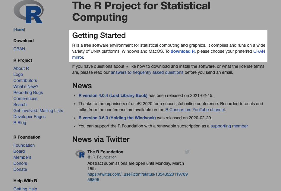
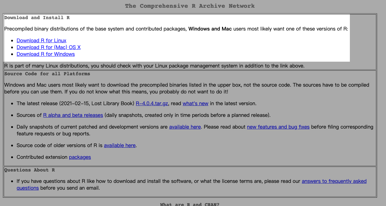
You can select the default link https://cloud.r-project.org/.

Download and install a version that match your OS.
Install RStudio:
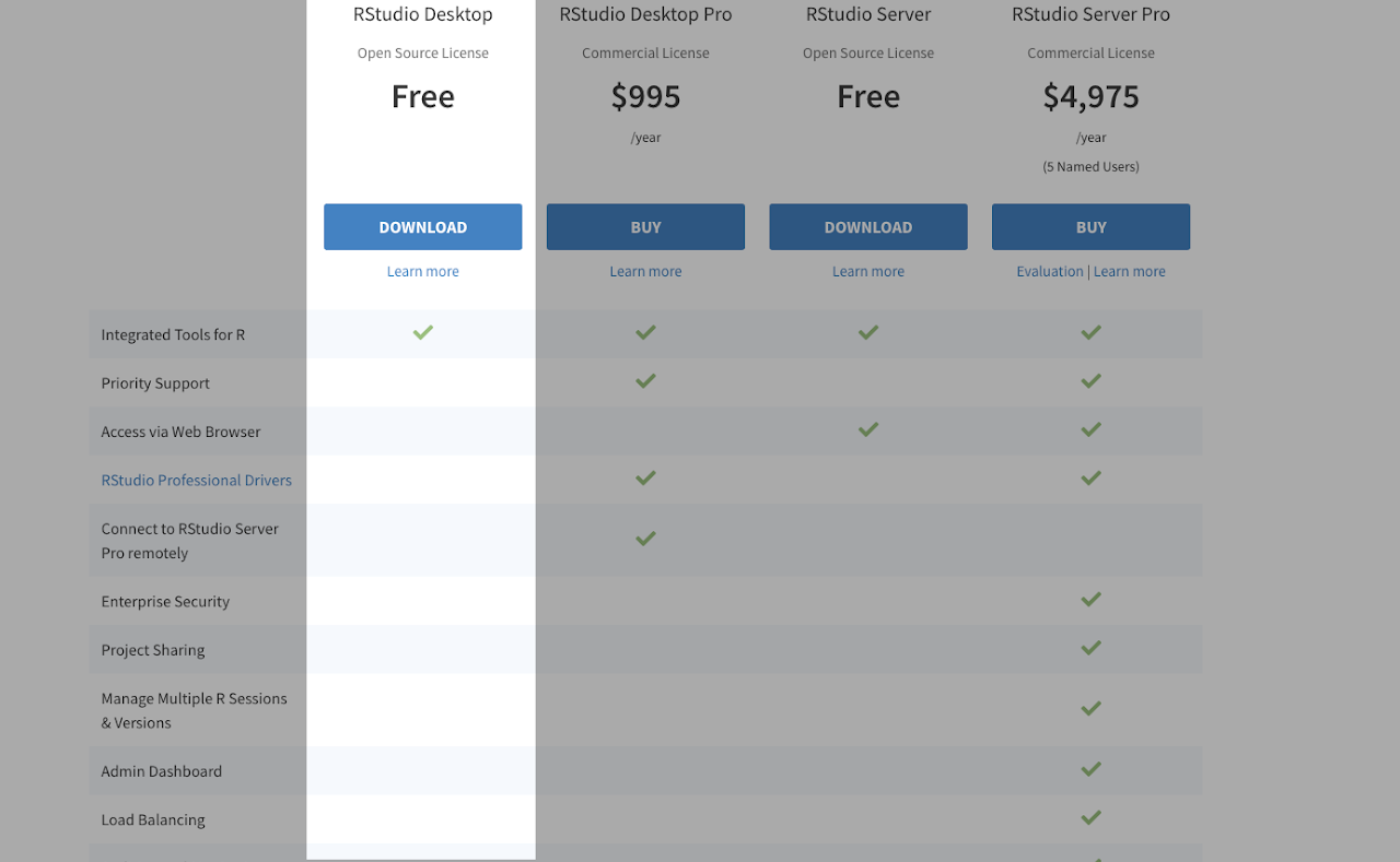
Download and install RStudio from https://rstudio.com/products/rstudio/.
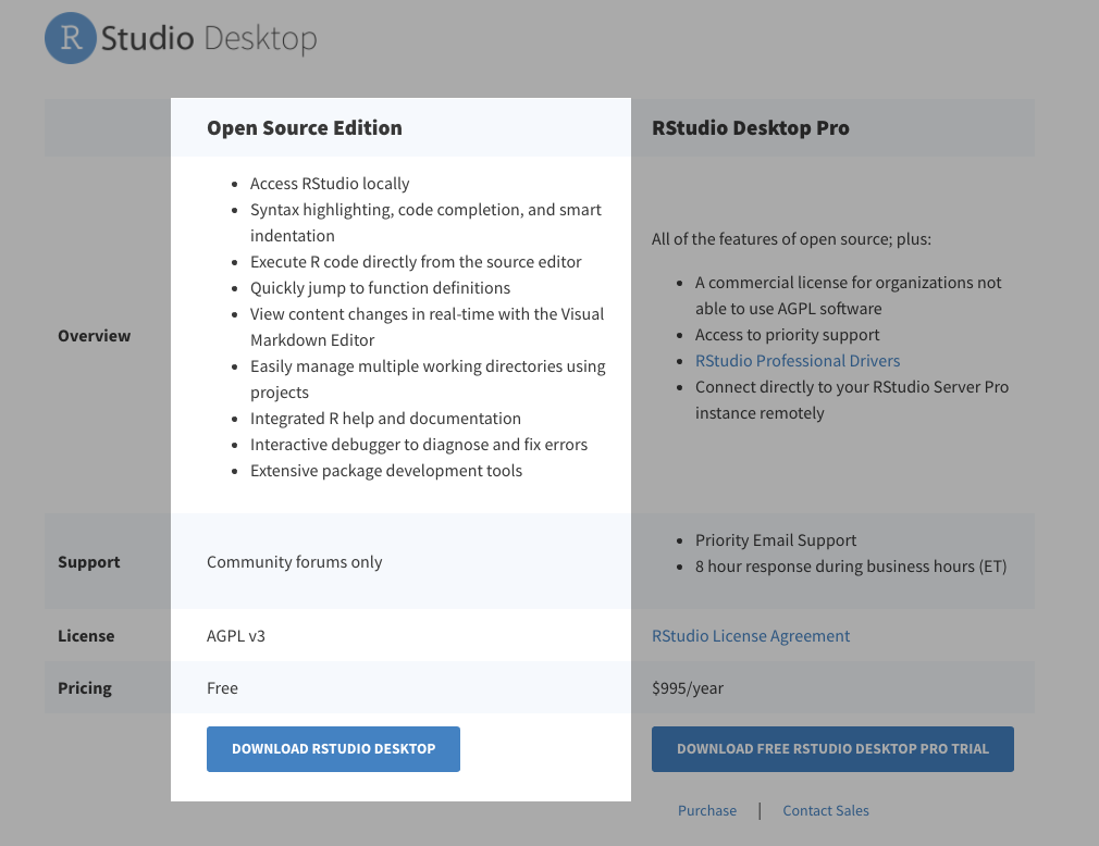
Download the free version.
Setup the project:
Create a folder in your local machine where you want the project to locate at. Open the terminal and set the direction to the created folder. Run the following command:
git clone https://github.com/komar41/Big-Yellow-Taxi.git.

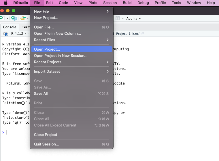
Open RStudio. Go to “File” and select “Open Project”.
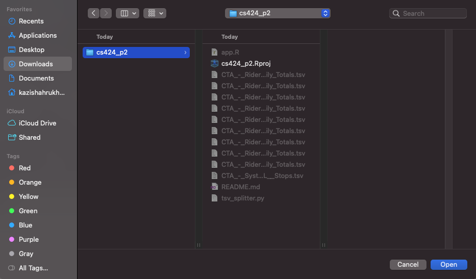
Choose the project folder (“Big-Yellow-Taxi”) that you cloned from GitHub.
Open the file “app.R” and press “Run App” button on RStudio.
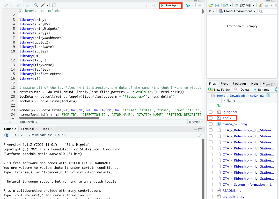
Rstudio will tell you if you are missing some of the packages. When the pop-up shows up, click “Yes” to install all those packages.
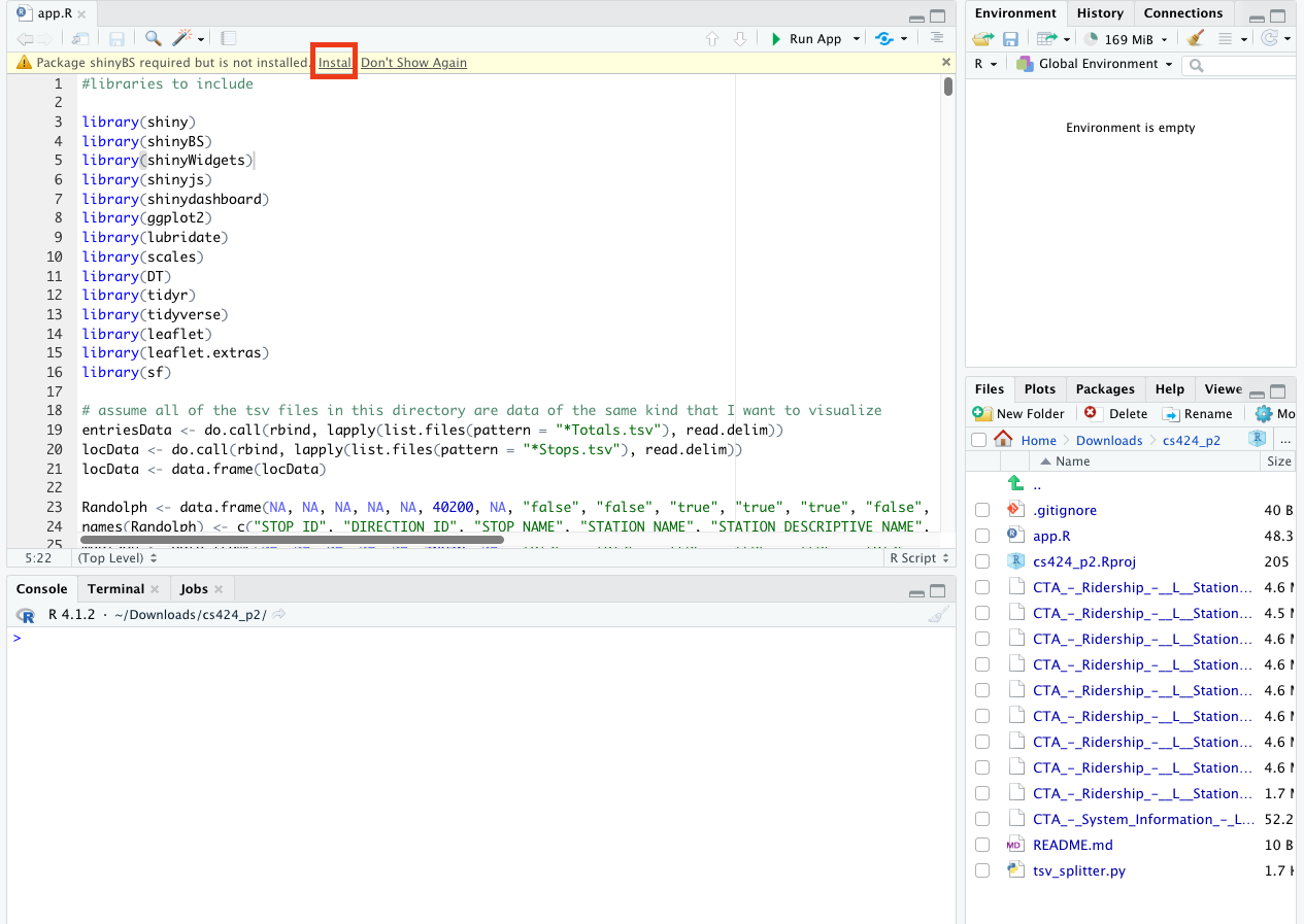
After Installation of those packages, RStudio will start a Shiny app on your local machine.